Make-up Program - Baby Names
This project is based on the NameSurfer project by Nick Parlante at
Stanford.
In this project we will graph data about
American baby names taken from the Social
Security Administration Web site.
We will read the data, store it in a dictionary data structure, and then
let the user type in names.
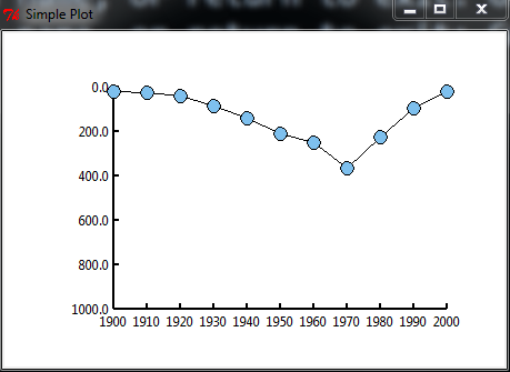
If a name appears in our data, we will open a graphics window and
draw a graph, like the one above, showing how the popularity of the name
changed since 1900.
This graph is for the name Grace. It has low rank near the beginning
of the century (so the line is high - number one should be at the top)
and then dips down in the seventies, meaning that the rank of the name
is greater (less popular).
Input file
The data file:
names.txt
contains a list of first names, each followed by eleven numbers
which are the ranks of the name in the decades ending in
1900, 1910,...,2000.
The rank of a name is the index of the name, when all the top
1000 names for that year are put into a list from most popular to least
popular. So the most popular name has rank one, the second-most
popular name has rank two, and so on. If a name was never in the
1000 most popular names, it does not appear in the list at all.
If a name ranks in the top 1000 in some years, but not
others, it gets a rank of zero in the years in which it did not make
the top 1000.
Graphing module
The graphics module
canvasPlot.py
uses tkinter, the built-in Python UI module, to draw a graph.
You can run it as it's own program to see an example, and
import the function drawPlot() into your program to do the
drawing.
Program Requirements
Your program shoud read in the file names.txt.
It must store the data in a dictionary, where the keys are the names
and the data stored at each key is a list, containing eleven
integers representing the ranks.
After reading and storing the entire file, it should loop,
asking the user to enter a name.
If the name is a key in the dictionary, it should display a graph
like the one at the top of this page, using the
module canvasPlot.py.
For every year, the height of the line corresponds to
1000-(the rank of the name),
so that if a name has low rank, its line appears higher on the
graph. The exception to this rule is that if
a name has rank zero, that means it did not make the top
1000, so its line should appear at the very bottom of the graph.
When the user kills the window containing the graph, your program should
ask for another name, until nothing gets entered.
It is OK to make the user capitalize the first letter of the name.
Suggested steps
First, open names.txt and make a file reading loop
that prints out just the first line of data (it's a very big
file, don't print the whole thing).
Then, extract the name ("A") from the line,
and the strings representing the
eleven ranks. Convert the ranks to integers, replace all zeros with
1000, and put them into a list.
Print out the list to check that it is a list of eleven integers.
Create an empty dictionary, and then store your list into the dictionary
using the name as the key.
Then try retrieving the list from the dictionary, using the key,
and print it out to make sure this is working.
Once you can handle the first line, you can probably handle the whole
file.
Make a loop which reads the whole file, storing the data from every line
into the
dictionary as you go along.
Put the loop into its own function, which returns the dictionary.
Once you have the dictionary, try getting data out of it.
Get a name from the user, and look up and print out the list
stored under that name.
If the user does not enter a name, just hits return, your program should
exit.
Now work on drawing the graph using the canvasPlot module.
You will have to modify the module.
Start out by running it as it's own program to see what it does.
Look at it's main() function to see how drawPlot is called.
It is a good idea to make a little sketch on paper of
a typical graph, to keep track of what the coordinates of
the various line end-points are in the window.
The graph as given is drawn in a 300x200 rectangle, starting at
position (100,250) in a window of size 450x300 (remember the
y-position is 0 at the top and 300 on the bottom).
You can use the same rectangle, but you'll need to change the
labels on the x axis to 1900-2000, and the labels on the
y axis from 0 at the bottom to 1000 at the top.
Then you'll need to rescale your data so that, for instance,
the pair (1900, 1000) is rescaled to the window position
(100,50) (upper left corner in the 300x200 rectangle where the
chart goes). An example of rescaling is included in the main()
function in canvasPlot.
Programming advice
Remember, writing a big program is a constant battle against bugs.
Developing the program slowly and methodically helps find them
quickly.
- Write the program in small steps, running it after every few lines.
Make sure what you have written so far works correctly, not just that it
does not crash, by printing lots of stuff out as you go along.
Don't go on until you know what you have so far is working.
Adding more code will almost never fix existing bugs.
- Every time you try the program, have a guess as to what it will do.
If your guess is wrong, figure out why before continuing.
Do not just try things randomly to see if they will work; they won't.
- If you don't fully understand a command (for instance, using a dictionary), spend some time in IDLE experimenting with it before putting it into your
program.
- Use functions to break up the program into managable pieces.
For instance, in this program you could have a main function,
a function to read the file and build the dictionary,
a function to get user input and find the corresponding list of ranks
in the dictionary, and a function to build the list of tuples as
the input to drawPlot, rescaling the x and y values.
You can test each function
by itself and then put them together.
- Parameters of a function should have different names than the variables in the program to which they correspond; remember that they are seperate variables.
- Only use try...except (exceptions) to check numerical input or
to check if a file exists - things that there is no easy other way to do.
It is not a general method for covering up the errors in your program and
can be very dangerous if misused. Only have one line in the block under the
try.
- Use global variables rarely, if at all.
Let main() be the only line of code not in a function.